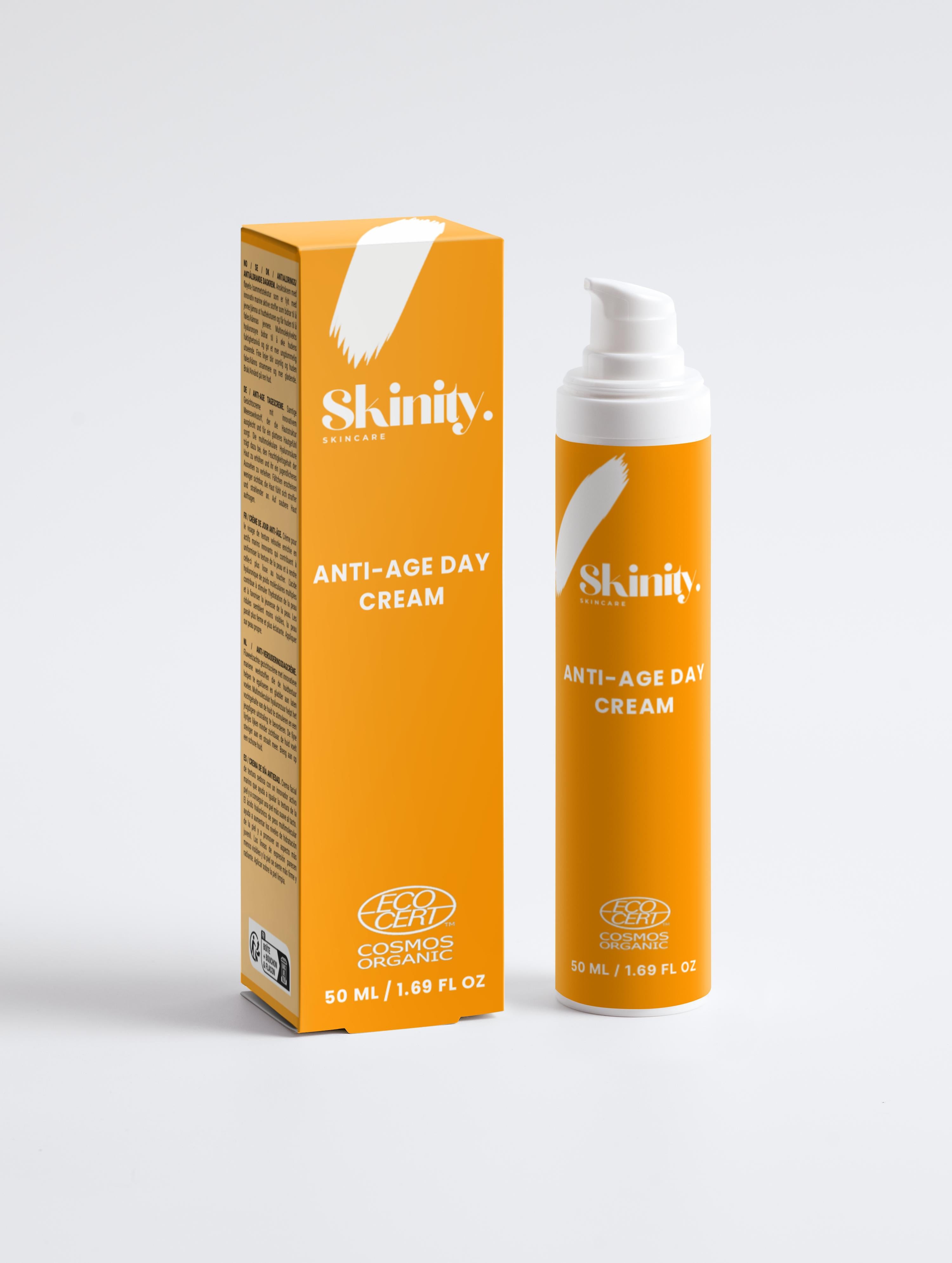
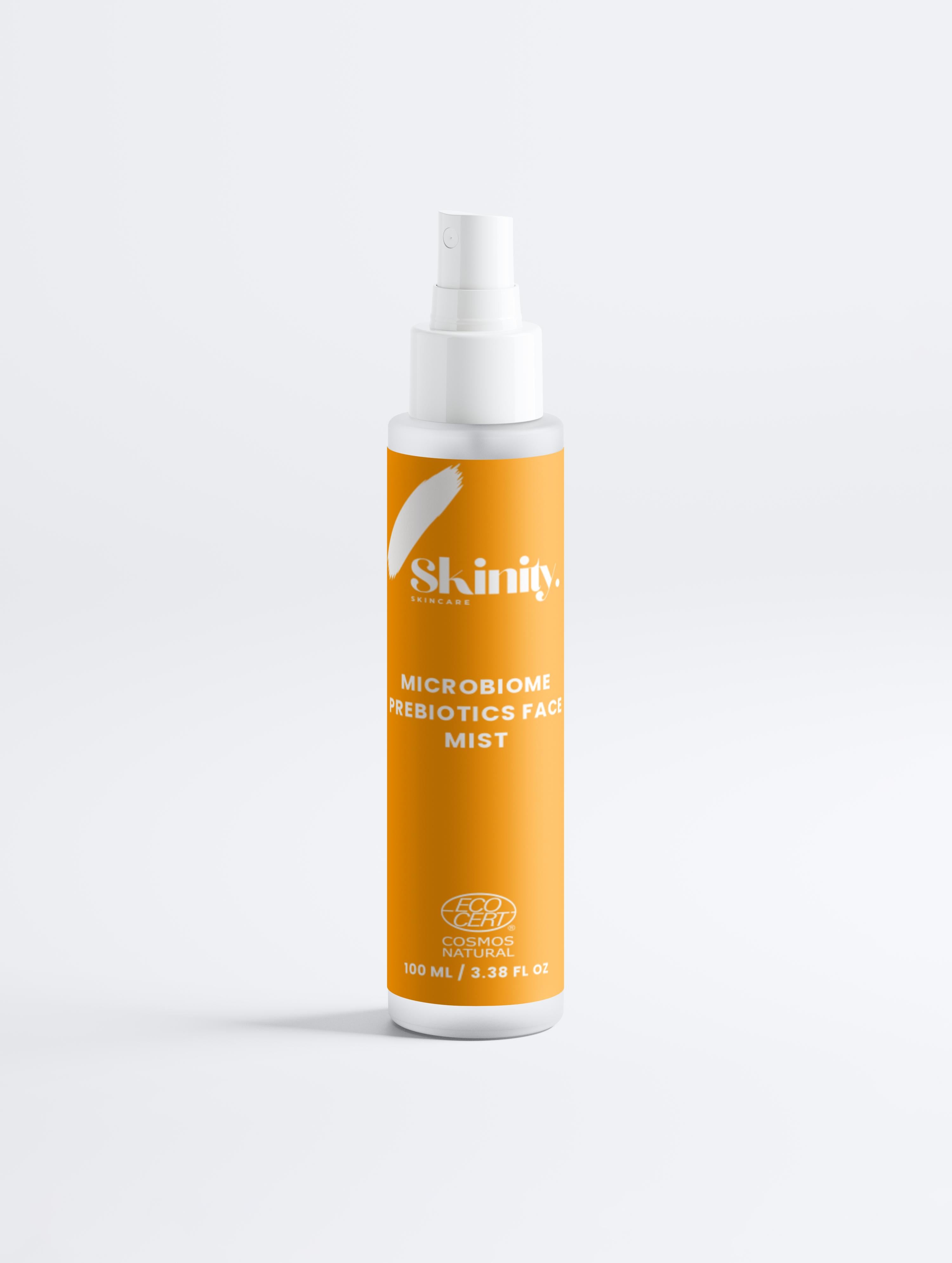
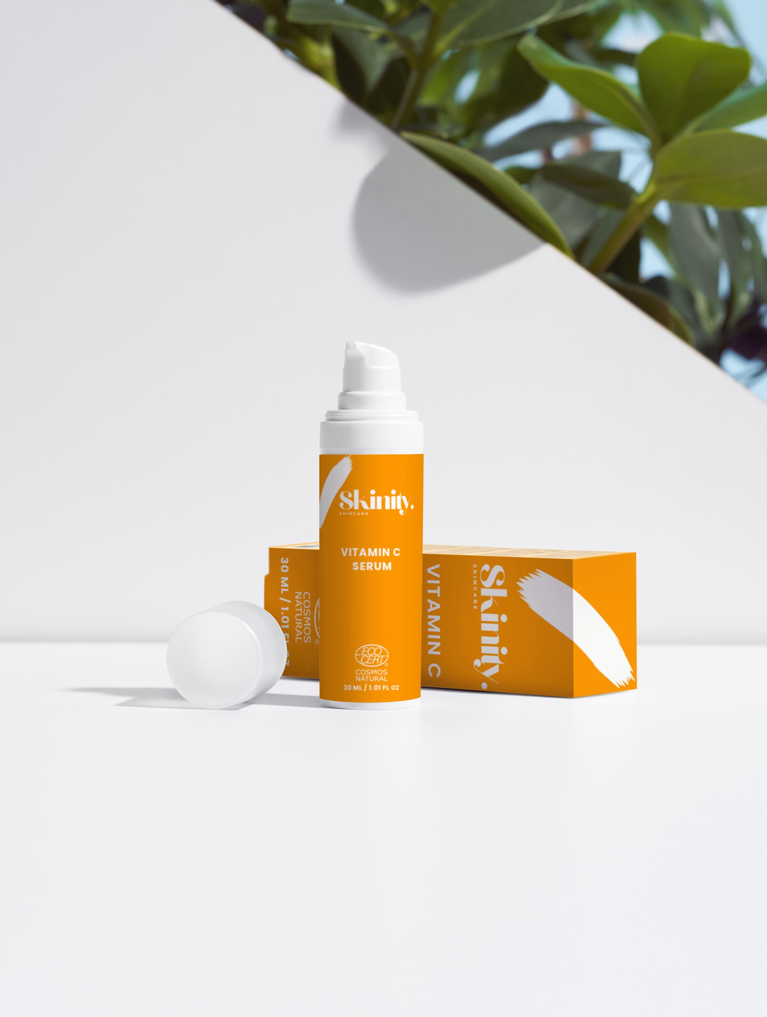
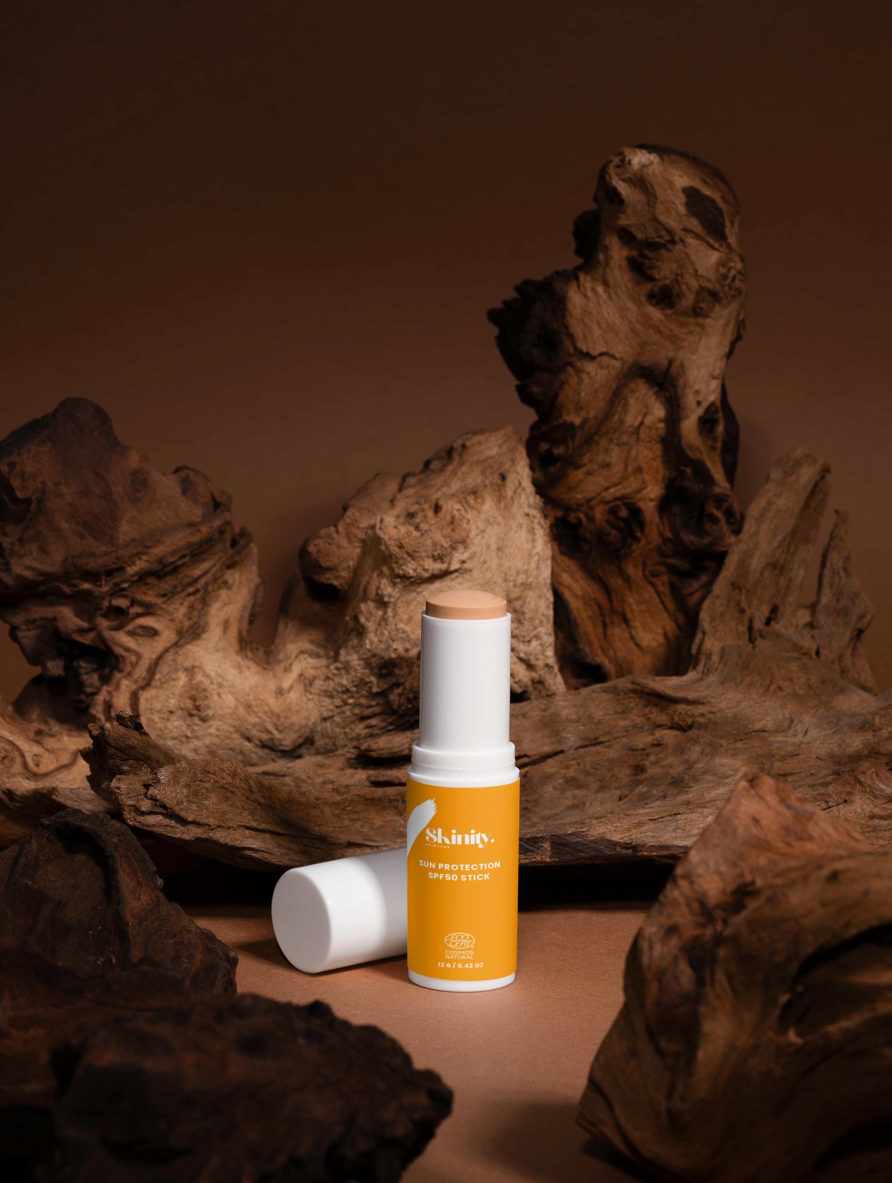
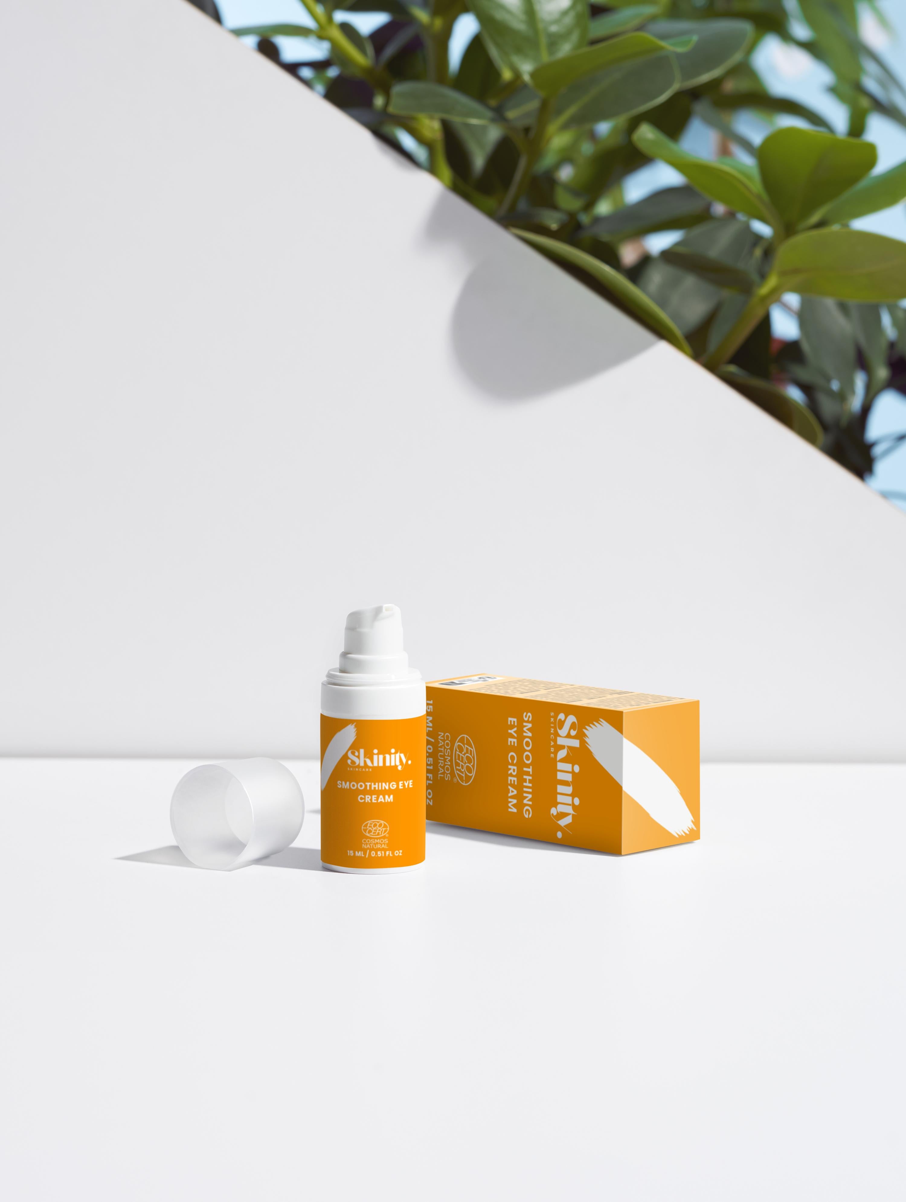
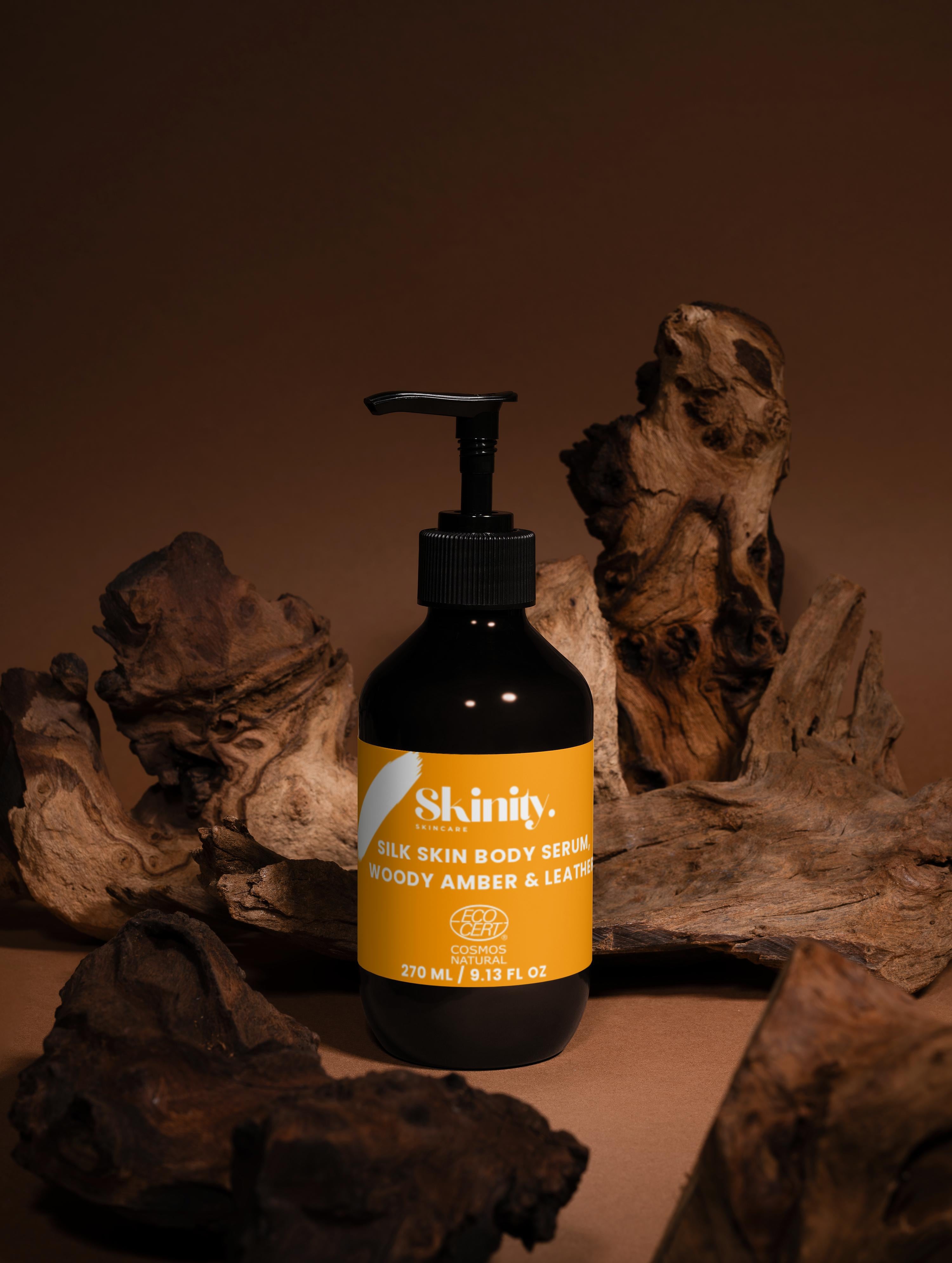
The home page design reflects Skinity’s clean, modern, and confidence-driven identity with a strong emphasis on purity, aesthetics, and a premium skincare experience. Every visual and structural element is intentionally crafted to create an immediate sense of clarity, trust, and harmony, allowing visitors to understand the brand’s values and mission within the home page design first seconds of browsing. The design follows a balanced minimalistic approach, where every block has a purpose and every detail supports the brand’s message: simplicity, quality, and transparency.The layout prioritizes smooth navigation and intuitive product discovery, making home page design it effortless for customers to explore bestsellers, new arrivals, and targeted skincare solutions. High-resolution product photography combined with clean spacing and gentle color accents highlights the luxurious, science-backed formulations at the heart of Skinity. Each section guides the user naturally—from the hero banner that introduces the brand’s philosophy, to the featured collections that showcase Skinity’s most loved treatments. Typography plays a key role in communicating elegance and professionalism. Soft, modern fonts paired with carefully measured spacing create a visual rhythm that feels calm, trustworthy, and sophisticated. The chosen color palette enhances this feeling, combining subtle neutral tones with delicate highlights that reinforce the premium nature of the products. Every composition is engineered to visually mirror the purity and effectiveness of Skinity’s skincare formulas. The content on the home page highlights Skinity’s core pillars: high-quality ingredients, clean formulations, and scientifically supported results. Informative, concise text introduces the benefits of each category, helping users make confident decisions based on their skin needs. Transparency is a central theme—Skinity communicates clearly, without exaggeration, ensuring that customers feel educated and respected rather than overwhelmed by marketing claims.
Interactive elements such as call-to-action buttons, collection previews, and smooth scrolling help maintain engagement and guide customers seamlessly throughout the store. The layout is fully optimized for mobile browsing, ensuring the same refined experience on smartphones and tablets. This accessibility reflects Skinity’s commitment to providing exceptional convenience and performance for every visitor.
The design also incorporates trust-building features such as customer testimonials, ingredient highlights, and educational links to blog posts, allowing users to explore deeper knowledge about Skinity’s approach to skincare. By integrating storytelling with product presentation, the home page creates an emotional connection that strengthens the brand’s presence and credibility.
Overall, the home page design embodies Skinity’s belief that skincare should be simple, effective, and elevated. It delivers a refined user journey that connects beauty, science, and functionality into one cohesive experience. Every detail—from layout structure to visual language—reinforces Skinity’s dedication to excellence, making the brand feel premium, gentle, and reliable from the very first impression.